Showing posts with label painting. Show all posts

Tuesday, June 4, 2013

Post-Graduation

School's finally over, and I've been cruising right along project-wise ever since I got back into New York. I think the fact that I was so burned out last semester helped me find inspiration faster once I was free to do what I pleased, and I have to say it's been a lot of fun so far. For the past month, and next few weeks, I'll be working on as much art as possible. At the end of June I'm headed back to Buffalo to room with my brother- and that means I have to job hunt for a part time position somewhere hopefully nearby to pay rent and the impending school bills, and get resettled after moving again. So things might get stagnant for a little while after that.
For now though, I've completed two new paintings, and started a third (the digital line comp was done last week so it's a bit further along than that right now). The Daft Punk piece was a lot of fun to work on, and it helped me develop a much more intuitive and efficient way for doing final layout and color comps. The painting with the girl in the yellow dress was a trade through the pretty recent tumblr group- Crayon Crunch. Essentially a monthly secret santa event where people sign up by sending an email out of one of their original characters, and they'll be depicted by someone randomly chosen. The character I received for May was Ironmary's Mariska Morevna.
The third wip piece is something I'm playing with, concerning individual songs by groups I'm really fond of.


As usual there's a lot more to see on my tumblr: http://klang-art.tumblr.com/  where anything and everything goes up!

Tuesday, April 2, 2013

Some stuff

This semester (as usual) is out to get me.  Bless whomever's in charge that this will be the last one.  All griping aside though, I have a couple of new paintings to show for it (I'm already glaring at Brazil, but Marlfox is still ok in my book).


But now there's only one month left, so what have I got up my sleeve?  Good question.  There's some projects that are trailing along to be completed soon-ish, a couple new things to be started, and some stuff I'm really ridiculously excited for that I won't get an opportunity to work on until after school.

In progress is lots of ceramics work, which I won't have pictures of until after graduation.  Also in progress is my other sculpture work for the semester:


Apparently I really really need a fantasy creature's taxidermy head attached to the wall of wherever I'll be moving to.  He's a good bit farther along than this right now (hoping to start his concrete mold on Monday), and he's been my fun salvation this semester.

On the 'to be started' front, there will be one more painting for my Advanced Styles and Concepts class (looking to illustrate a fairy tale) and a second short story for my writing fiction class.  Which I plan on converting into a web comic as long as I'm happy enough with it once I've completed writing it.  Sci-fi is all I'll say for now, but hopefully I'll be able to digitally play with some character and environment concepts so my head will be in the right place post-graduation.


Monday, October 22, 2012

Long Live the New Flesh

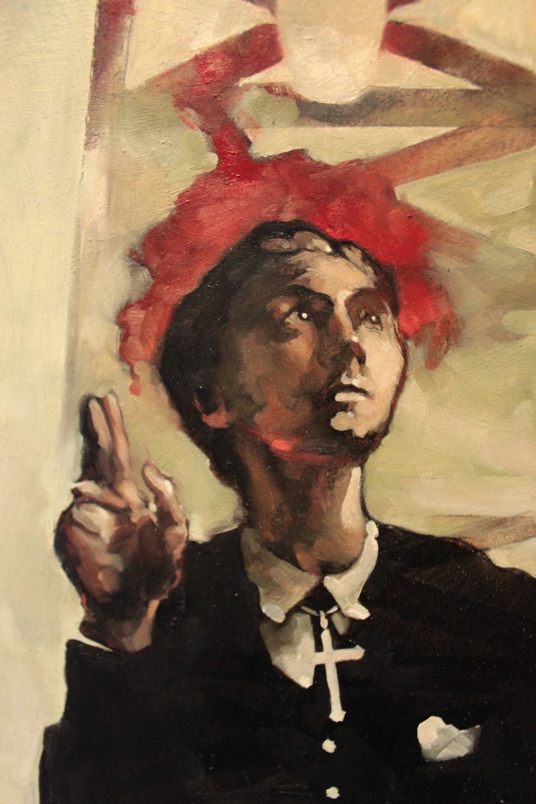
Movie have played an important role in my life.  Being able to create something new based off that passion is a rush that drives me to hone my craft only that much more.  So, when CCAD's Illustrative senior-level class (Advanced Styles and Concepts) handed the reins over to me, movie posters were the first thing on my list.
One restriction was provided for a set of 3 illustrations- we were to create a series of 3 ads/posters/announcements about an event or character or who-knows-what.  I looked into upcoming film anniversaries and compiled a short list which I posted on my tumblr.  I received a good chunk of feedback on what people would like to see and David Cronenberg's Videodrome was chosen.
For the first teaser poster, I knocked together several thumbnails, four of which I refined:


Two were chosen by the teacher and myself, which I cleaned up more:


And in the end, we have our first final!


Now the tricky part- creating two more original concepts to see this series tied together nicely.  

Tuesday, October 9, 2012

Halloween!

This was a project for Children's Book illustration- essentially we had to create a wrap around cover for Cricket magazine with an autumn/harvest/halloween theme.  I came up with the idea of monster children going trick-or-treating in normal folk town and scaring plain folk.


After thumbs and what not, we arrived at a final layout


Playing around with color schemes


Final color comp


We then had crits in class, and the teacher felt in terms of the magazine layout, I should flip the image to have a more rewarding lead in to the back cover.


And finished!


All in all I'm not super satisfied with how it turned out, but there are aspects I can't help but appreciate.  

Friday, September 28, 2012

A session in landscape.

Ok, I know I post about this class a lot on here but I felt it would be nice to give a run down of why I'm particularly fond of it and how it affects how I work.  

Now, being an illustration major, the majority of my classes are, well, based in illustration.  Which is fine but it gets to be particularly frustrating when you realize you're just as behind in composing original images as you are in painting the final product.  Last year I took landscape painting not knowing what to expect.  What I got out of it was an invaluable opportunity to play with paint.  It wound up building not only my ability to compose competent environments, but also my style.  
When you're put on location for (at most) 3 hours to create a painting that is compelling and could be considered finished...you're not quite sure where to begin.  It only takes some practice to get in the swing of things and this painting class pushed my skills on my illustration projects so much farther than if I'd been left alone. 

Needless to say I signed up again.   When starting, I kept with my habits- earth tone palette and underpainting, "fuzzing" painted areas to draw the viewers attention to where I wanted, etc.  Then something important happened (at least, I'm assuming it's important).  I was told to (a)- not blur areas unless completely necessary, and even then reconsider. (b)- break my comfort zone with earth tones and play with color.  I agreed, acknowledging my weak points and lo and behold, there was color.


Intimidation.  Pure highlighter green and simple.

Ok, I've chosen my view, have my borders mapped off, some quick pencil work to indicate where things should be.


Quick underpainting consisting of cobalt blue/paynes grey.


Laying in colors.  Ugly?  Yes.  Expected?  Yes.  Moving on.


And right around here that start-off color is throwing me.  By being so bright, anything I put down appears in comparison to be nothing more than vaguely differentiated hues of mud.  This is not good.


Still pushing forward you can tell how mad I'm getting at a painting by how much I've scratched guidelines into it with the opposite end of my brush.  Questioning what made me think I could paint.

It's going downhill.  Rage quit foreseeable future.

Colors and brushstrokes in general have been softened, adding a bit more warmth and consistency.  (apologies about the difference in photo color- adjusted my lighting settings and forgot to change them back)


Looks like the nasty has come to an end, with some sky popping up and more work in the foreground.


And where she lies now.  Still need to go back and fiddle with the sky (ran out of time in class).

In the end, I need to continue with this "color" thing.  It's taking me to unexpected places and I'm curious to see how it pops into my illustrations this year.

Thursday, September 13, 2012

2012 thus far.

Alright, just going to post a medley of stuff that I've been working on so far.  Will do a more in depth post on a single something or other this weekend!


Sunday, July 29, 2012

Painted film.

Anyone who knows me knows it's no secret that I have an obsession with movies.  It was only a matter of time before that finally found it's way into my art, and it's finally done so with a bit of a bang.  Looking at how these pieces stand up next to my work from the rest of the year, I have no idea what took me so long to finally get to this subject.  That being said, I think this will be a common subject choice for future work.

Now Alien had been dwelling in the back of my mind for a while this year and while I'm not entirely happy with it (wish I'd thought out more thumbnails and compositions, making it more experimental at the start) it still turned out fairly decent I think.


There was still a lot I had to force myself to push color and contrast-wise, and even then I was fairly leery of it.  As a result, a few paintings in the near future will feature more strict color-palette choices and more experimental values (no more of this hiding in the middle norm, I need to push these things that I'm finding I'm uncomfortable playing with). 

All of that being said, the second movie piece I wound up doing kind of at random has made me absolutely giddy with future experiments.  I had no idea what I was doing half the time while working on this painting, so when things kept winding up looking great I was a bit astounded.  Eli is therefore my encouragement to get the hell out of my comfort zone and start playing more.  My paints are demanding more spontaneity and they're quite right in doing so.


And some detail shots for those of you who are just as obsessed with paint strokes as I am.


   As always, if you want to see more progress shots or other various projects that haven't made their way to this blog, check out my tumblr.

Monday, July 16, 2012

The Griffin

So far this summer I'm surprised at how productive I've been.  Now that I'm done moving until the end of August things have been kicked up another notch and the first piece to be finished is this particular painting.  Overall I'm rather pleased with how it's turned out!  Initially after drawing out the line work for the underpainting I had to cut off more from the sides for a much better perspective.  Beyond that it's been a fairly trouble free journey.  Why?  As I'm quickly figuring out reference and best of all lighting is your best friend.
After creating the drawing on the board and cutting down the edges, I shot several different lighting scenarios on a quick little sculpt I did of the pair.


Following those shots and my culmination of reference ranging from various antelope and deer to owls, hawks and eagles the underpainting progressed and was finished within a couple of hours at most.  


Not quite my usual method but it worked nonetheless.  
At this point colors are the biggest obstacle.  And I've kept it no secret that I'm pretty terrible at colors.  But between advice I received from Tardigrad (whose work you should definitely check out by the way) on another project and a painting I've always adored it wound up being fairly straightforward.  


The painting I'm referencing is Horace Vernet's The Lion Hunt.  I realize my colors are more muted than Vernet's palette but I would be remiss to not credit this work with this post.


In the end the brushstrokes just fell into place better than I could have hoped for and I'm glad whatever my style's become is finally finding a happy place.


In the end I've wound up with a piece that I have learned a lot from and that also made me remember how much I really do enjoy painting.  I couldn't have asked for more.